Understanding Color Theory and How to Mix Colors with Confidence
What colors go well together? How do I get my colors not to look muddy when mixing?
These are just some of the questions I get in emails from readers about color mixing.
This guide will be covering color theory and how to use the color wheel with confidence.
What’s Inside:
- You will learn about Color Zones
- How to Use it to Mix Colors to the Desired Hue, Shade, and Tint
- Color Mixing Tips
- Explore Color Expression and How to Use it in your Art
- Examples of Color Theory in Art
- Best Color Palette Sites for Artists
What is Color Theory, exactly?
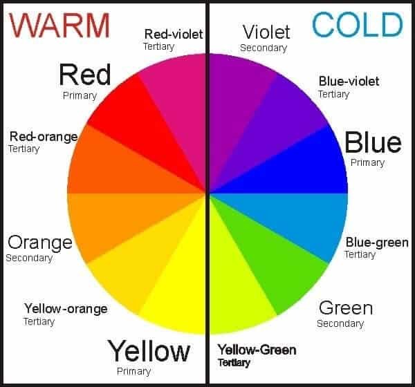
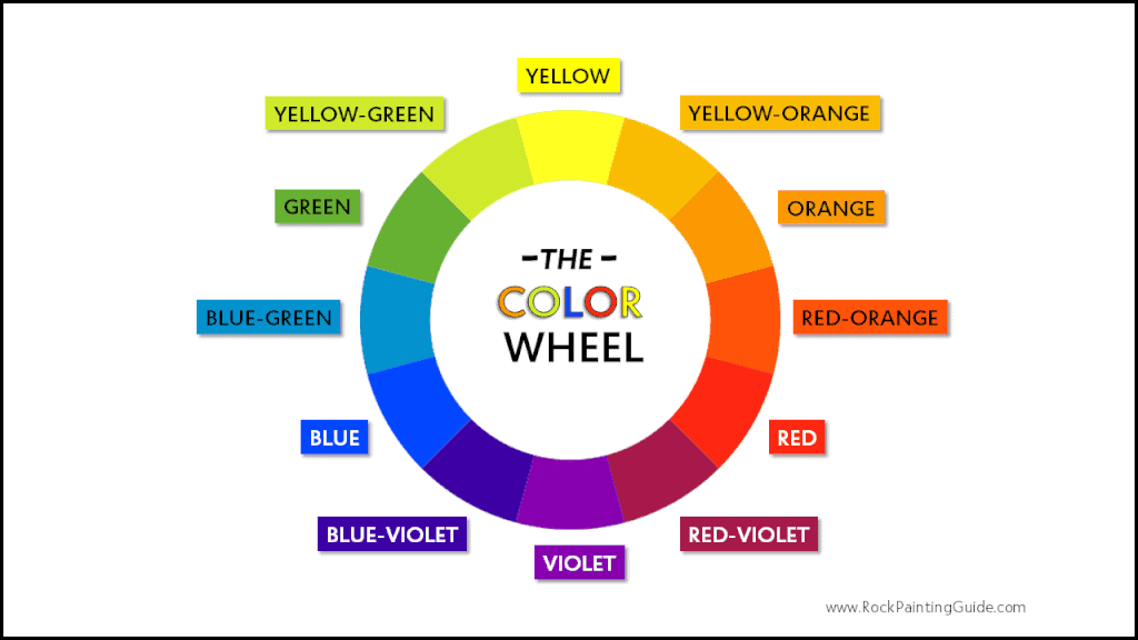
Knowing how to mix and use color is crucial to any painting. The color wheel is an important tool and should be in every artist’s toolbox. The first thing to know when understanding color theory is that there are three colors that cannot be made by mixing other colors together. These are the primary colors: red, blue, and yellow. The color wheel is broken down into color zones known as primary, secondary, and tertiary colors.
Primary Colors
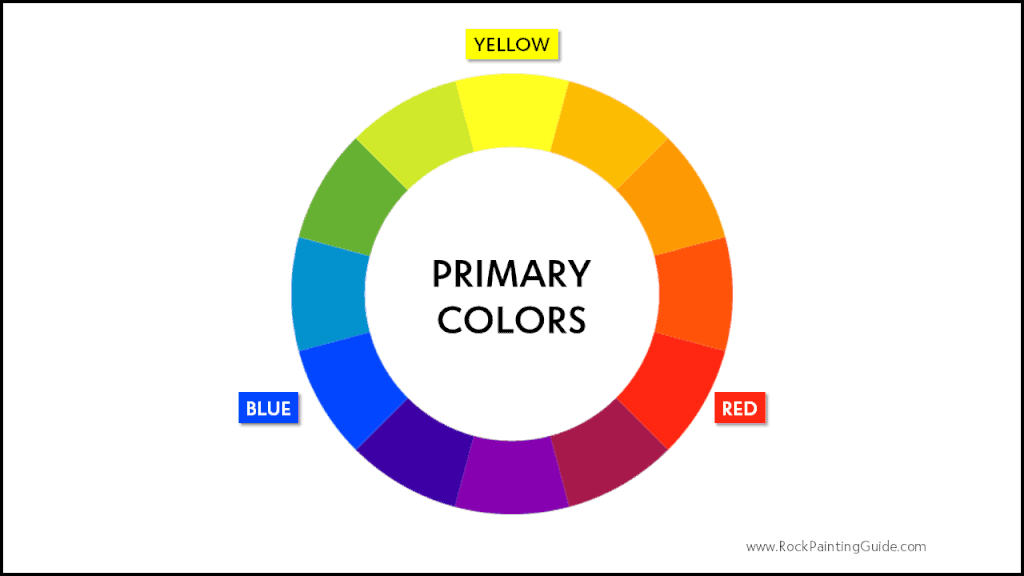
Red, blue, and yellow also known as primary colors. These colors cannot be made by mixing other colors together. This begins the introduction of the color wheel.
Secondary Colors
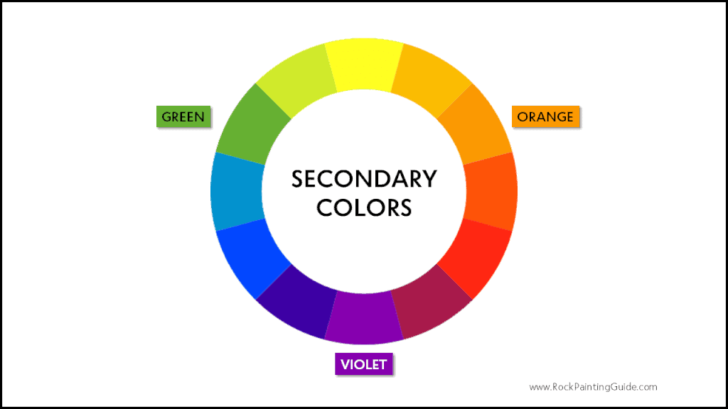
To create more colors on the color wheel, start by mixing equal amounts of two primary colors together to create a new color. For example, by mixing an equal amount of blue and yellow it creates green; red and yellow make orange; blue and red make violet.
Tertiary Colors
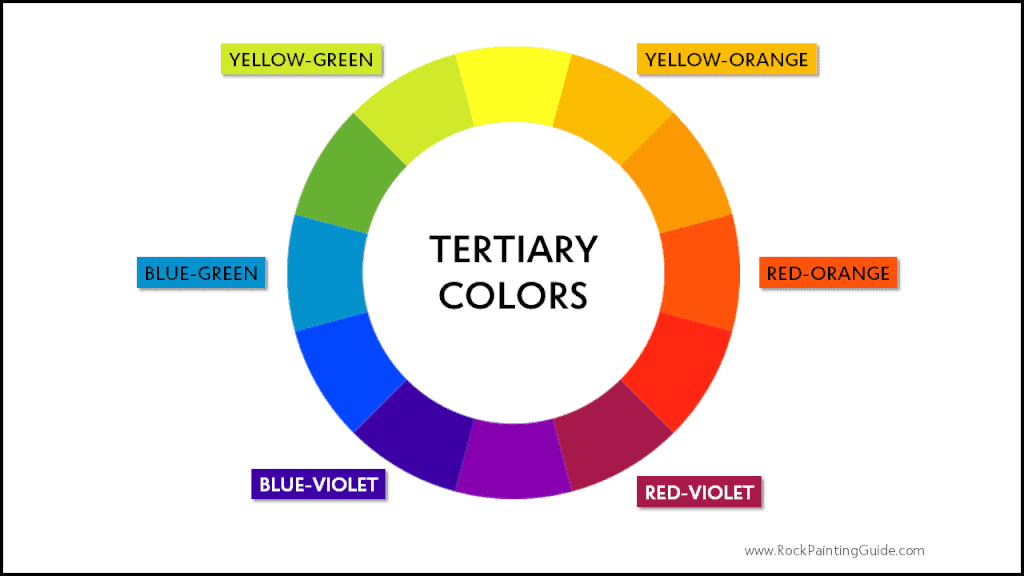
Tertiary colors consist of six colors made by combining equal amounts of a primary and secondary color. For example, by mixing red and violet makes red-violet. The other tertiary colors are red-orange, yellow-orange, yellow-green, blue-green, and blue-violet.
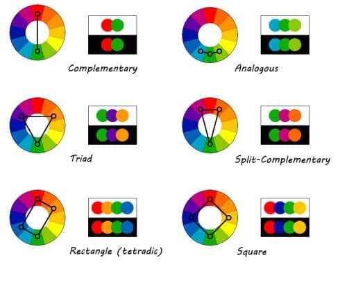
Complementary Colors
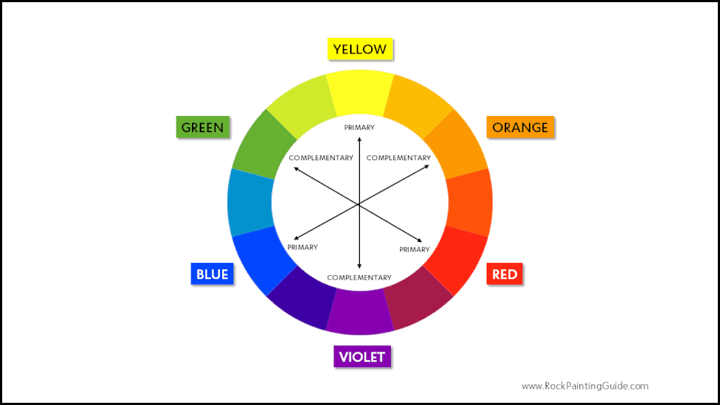
Complementary colors are colors that are opposite from another on the color wheel contrasting partners. For example, red is the complementary of green, blue of orange, and yellow of violet. This can also include secondary and tertiary colors as well. These colors are high in contrast and intensity making it a harsh color scheme and not balanced.
More color zones below.
Color Theory Terms to Know
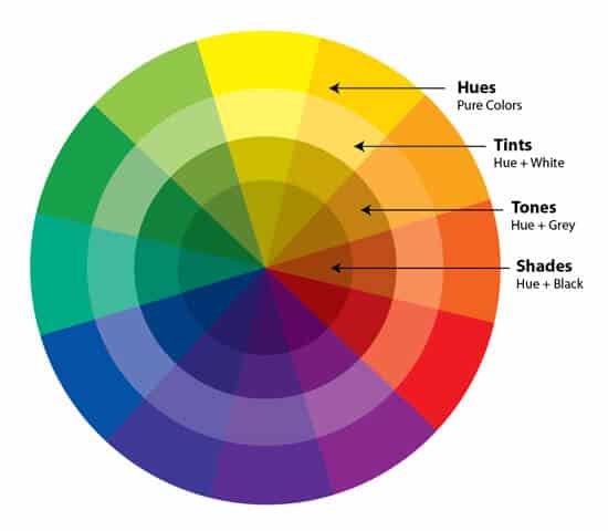
Hues – Are also known as color and often used to observe the color of objects. Hue refers to primary and secondary colors. For example, the hue of hunter green is green.
Intensity – This refers to how bright or strong a color is. For example, an intense vibrant color such as cadmium red loses its intensity when white is added to become pink.
Tone – Tone refers to the lightness or darkness of a color. Tones make vivid colors more muted by adding grey.
Shade – It’s a mixture of a color with black which reduces the lightness of that color.
Tint – It’s a mixture of a color with white which increases lightness.
Saturation – Is a measure of how pure a color is. To reduce the amount of saturation, try adding grey to a hue.
List of Essential Colors for Mixing
Here’s a list of some basic acrylic paint colors to help get you started mixing colors with confidence.
- Cadmium Red – This is a warm and relatively opaque color.
- Phthalo Blue – Is an intense color, but it should be When combined with burnt umber it gets very dark. To create lighter blues only use a small amount of blue mixed with white. A good substitute is an ultramarine blue.
- Cadmium Yellow – You can create lighter hues simply by adding white to it. To darken the yellow, add complementary colors like purple.
- Titanium White – Bright Opaque white; great for tinting colors.
- Mars Black – It’s a relatively opaque color; it must be added in small quantities when mixing.
- Raw or Burnt Umber – This is great for darkening the tone of hues. Raw Umber has a lighter cooler shade and Burnt Umber is a warmer rich brown.
- Phthalo Green– Is a bright green with a bluish tint. This makes it ideal for mixing yellow for a variety of green shades.
Tips for Color Mixing
- Bright colors tend to be more vibrant and rich next to neutral colors.
- Darker tones intensify next to light tones.
- Add white and/or yellow to lighten the color.
- Add blue and/or raw umber to darken the color.
- Acrylic paint will dry darker, so be sure to blend your colors a shade lighter.
- Start with a light color and gradually add a dark color to get the desired color. For example, add small amounts of blue to yellow to make green.
Express Yourself with Color
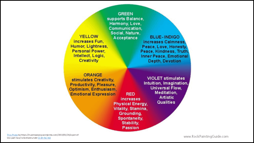
Expressing yourself with color says a lot about how you are feeling in that moment. Someone wearing a pink blouse may be in a happy positive mood. In art therapy, color is often associated with a person’s mental or physical state. Warm colors such as red, orange and yellow tend to represent life, strength, and strong emotions. While cooler colors of purple, blue and green can range from restful calm emotions to sadness and passive.
Learn to Mix Colors for Beginner’s Video by Katie Jobling
Examples of Color Theory in Art
Primary Colors
Red, Blue, and yellow also known as primary colors. these colors cannot be made by mixing others together.

Complementary Colors
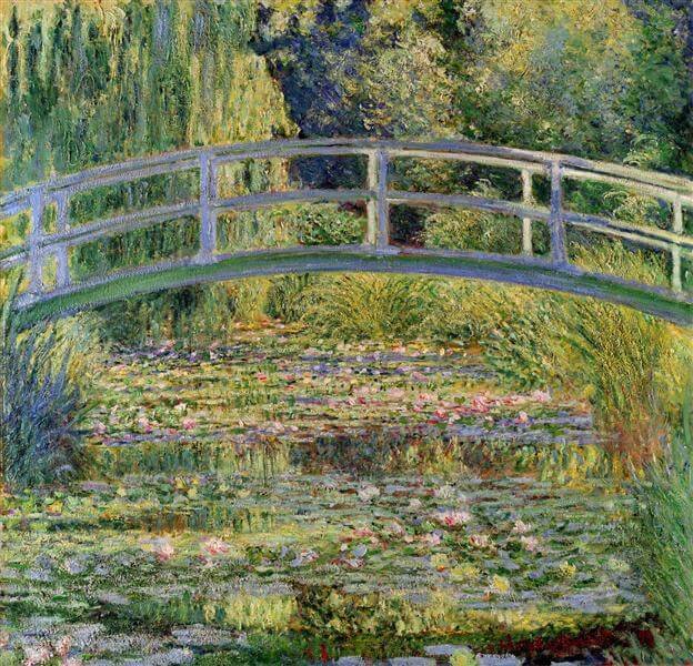
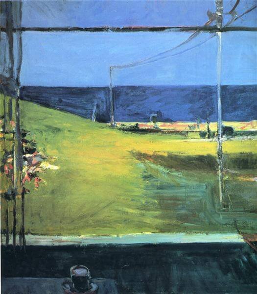
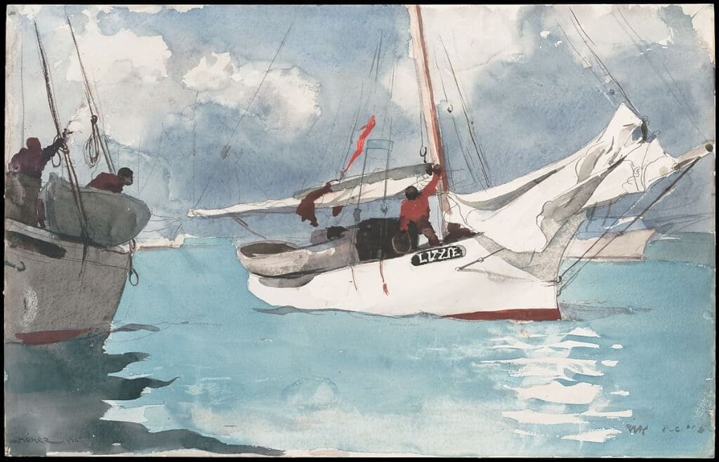
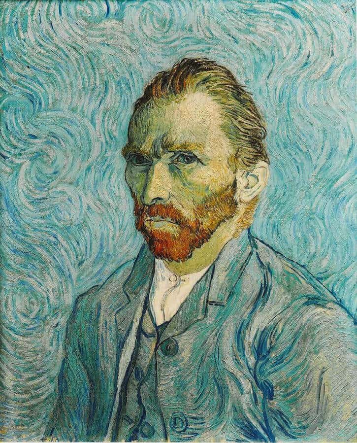
Colors that are opposite from another on the color wheel that are contrasting pairs. Painting (A) reveals red and green; Painting (B) reveals blue and orange complementary colors.
Analogous Colors
Analogous colors is a collection of three colors that are next to each other on the color wheel. Paintings (C & D) reveals blue, green and yellows.
Warm Colors
Red, Orange, and Yellow

Mandolina and Flowers, by Paul Gauguin 1883
Cool Colors
Blue, Green and Purple
High Intensity
Low Intensity
Best Color Palette Sites for Artists
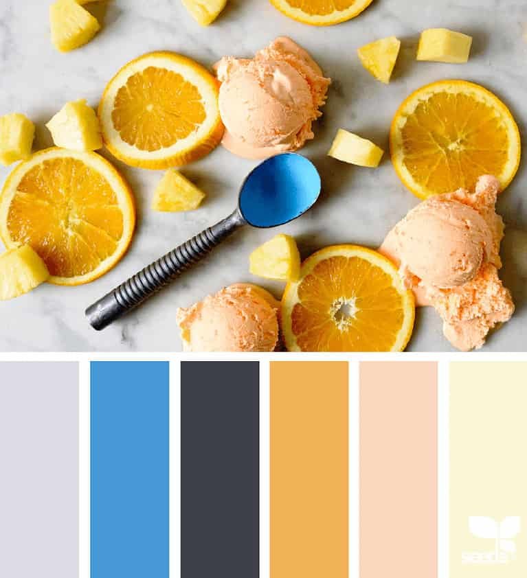
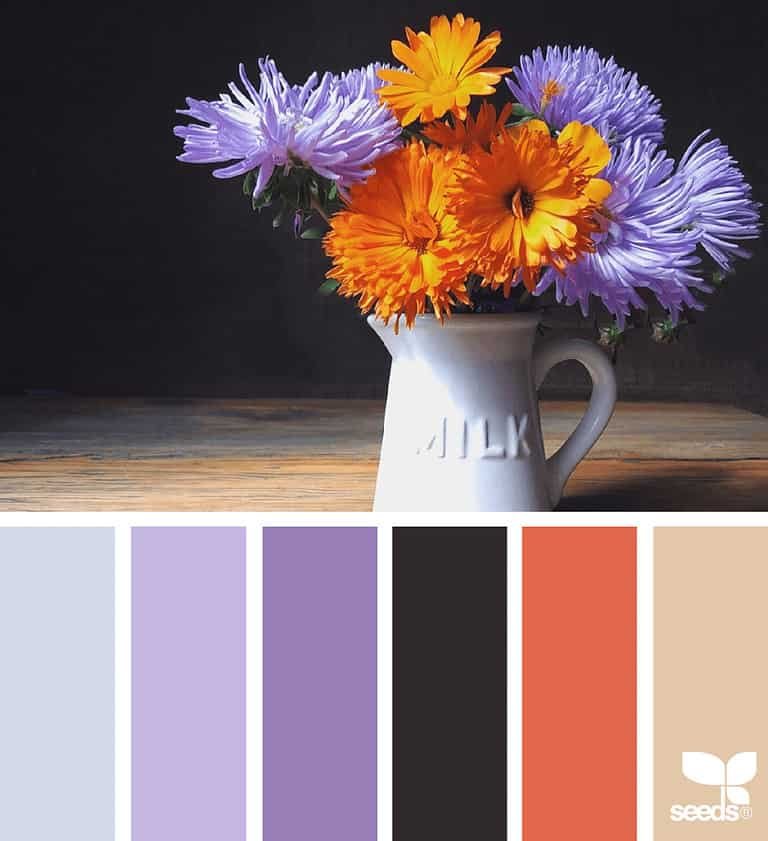
Choosing a color palette to work with can make you second guess yourself as soon as you start your painting. Here are some nice visual color palette sites to help make that decision process easy. I personally, love Design Seeds, it’s offers nice visual photos with coordinating color palettes.
- Design-seeds.com
- Paletton.com
- ColorHunt.co
- Coolors.co
- Colormind.io
- Colourlovers.com
- Canva – Canva makes it easy to upload your favorite photo and generates a color palette to match.
- Plaid Paints – Color Palette Inspiration PDF
That’s all folks! I hope you enjoyed this article and learned something new today. You can download a free pdf of this guide in our free resource library.
If you haven’t read the beginning of the series of Rock Painting for Beginners, check them out here.

